


How many times have you shopped online and caught yourself thinking something like:
- Wait a minute, that can’t be true. [X out of window.]
- There’s no way this shady site is getting my credit card info. Nice try. [X.]
- This is suspiciously cheap. I bet it’ll break the first time I use it. [X.]
If I had to guess, it’d probably be more times than you can count.
Whether it’s conscious or subconscious, we size up every single website we visit based on how trustworthy it looks. It doesn’t even matter why we’re visiting or what kind of site it is – we need to know we’re not wasting time reading false information, following bogus advice, getting phished, or buying a terrible product.
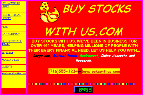
Image via Pinterest
What’s even more important is that according to eye-tracking research, it takes us just 50 milliseconds to form a first impression of a website. That’s the amount of time it takes a Lamborghini Aventador to change gears. Things just got serious.
So, how can you use that precious fraction of a second to get customers to take you seriously?
First Things First: Check Your Branding
You can put thousands of dollars into building the sleekest, sexiest, most user-friendly website ever made. But if your branding is off, you’ve got a fatal flaw on the launch pad. All it takes is a weird Microsoft Word word art logo, or an eye-aching color clash, for the visitor to knock your website – and your credibility as a business – down a peg.
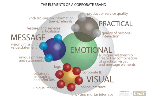
Image via Darren Leet Incorporated
In addition to things like a captivating hero and intuitive navigation, you’ll need to examine some deeper elements like your logo, fonts, colors, and visual assets in order to create a strong brand.
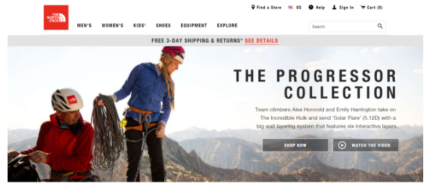
Take a look at The North Face. They’ve built a timeless brand that stands for quality in the eyes of its customers. The logo is simple, recognizable and memorable. Their website is clean and functional, giving you all the key options you need right when you land. They build a connection with the user by allowing them to put themselves in the shoes (or hiking boots, rather) of the adventurous outdoors-lovers in their hero.
Your Logo Is Your Identity
A logo can be a complex and powerful beast. There are many elements that go into creating a credible logo.
Remember to ask yourself:
- Does my logo truly represent my brand?
- Can people connect with it?
- Is it functional, clean, and crisp?
- Is it simple enough to still be identifiable in a small size?
- Does it still look good in black and white?
- Will it still be relevant when news or trends fade away?
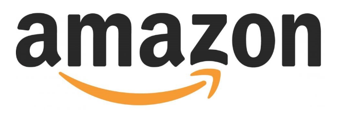
For a timeless ecommerce classic, Amazon takes the cake. This has an added layer of greatness because after it checked off all the boxes above, it still had room to incorporate clever “hidden” symbols.
When I first looked at it, I assumed the arrow symbolized movement – your item being brought right to your doorstep. But there are a couple of others. First, that arrow makes a smiley face for some subliminal feel-good. Second, did you ever notice that the arrow points from A to Z? This implies that they’ll help you find anything you’re looking for.
Take a look at some other logos: crisp images with clean lines and no excess. Once you start messing with gradients, bevels, and a full color palette, you’re opening the door to distracting from your message and over-complicating your presence.
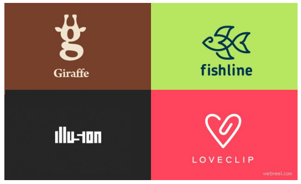
Image via webneel
If you’re unsure of how impactful your logo is, get feedback from people you trust. If you’re still uncertain, invest in a graphic designer to do some mockups, and compare your original and the new one.
Don’t skimp on logo design. A good logo can be worth its weight in gold. If you think hiring a professional is expensive, just wait till you hire an amateur…
Think of a Font as a Voice
If your web copy is the message you’re giving readers, your font is a visual representation of your voice. In addition to the mood it creates within the first milliseconds, font has a lasting impression on user experience.
Are you trying to inspire and empower them? Bold, sans-serif fonts with carefully-used caps can help you be more persuasive. There are even marketing theories that Barack Obama’s campaign was benefitted by its strong, consistent branding and the Gotham font that came to be synonymous with his image.
But when you’re using caps, be careful. This can backfire if users feel like you’re just yelling at them.
One more thing: we’re all adults here – you can ditch the Comic Sans.
Unless, of course, for one reason or another you have a specific business plan based around it. Then it’s fair game.
The Psychology of Color
Colors are more powerful than you might think. There’s a huge, comprehensive, and extremely interesting collection of research about the psychology of color and how it can be applied to marketing and branding.
For example, red is loud, exciting, and powerful. Blue is strong, stoic, and protecting. Purple is shrewd, experienced, and creative.
Of course, the exact impact varies from user to user, group to group (for example, men vs. women), and culture to culture -and there are some differing theories. Take a look at this awesome Color Emotion Guide for a crash course on colors.
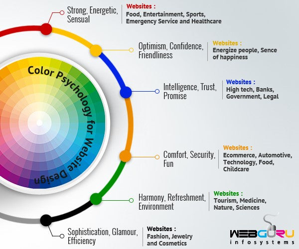
Image via Webguru
Humans Run Businesses – So Prove It
Another integral element is to show some personality and transparency. Somewhere along the line, it became okay to bring a sort of robotic, mechanical aspect to business. A cash register cha-ching and then moving on to the next customer in the assembly line.
In a cutthroat digital world with millions of alternatives, that’s not effective anymore. Ecommerce shopping carts are the new cashier clerk. Your website needs to speak to your customer’s humanity; to show them you’re real, you’re listening, and you are to be trusted.
A great way to do this is to feature photos of yourself and your team members. If you don’t want to take this route, consider using lifestyle photos of people using your product. Be wary of cheesy stock photography that can actually have the opposite of it’s intended impact and dehumanize your brand. Here’s a list of stock photo sites that don’t suck.
For the ultimate lesson on humanizing your brand, see the magic that is Old Spice.
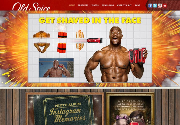
They’ve made quite a name for themselves in trekking territory that most brands won’t touch with a 10-foot-pole, and that’s the all-important sense of humor.
It’s important to consider that humor’s place in advertising and branding is controversial. For example, some say that it trivializes your message and your customer’s time. But when you have the type of product or service that shouldn’t take itself too seriously in the first place, it can work wonders for building relationships and gaining trust.
And let’s face it – toiletries are near the top of the list on products that shouldn’t take themselves too seriously.

Keep it Familiar
Familiarity is a prerequisite for trust. Amidst your revolutionary ideas, make sure that your website still incorporates tried and true elements that feel familiar. They’ll also ensure that your user doesn’t feel confused or alienated.
Here are some very basic elements that help breed a sense of familiarity but still leave some room for creativity:
- Logo on the homepage, but not necessarily in the top left corner. Keep in mind, however, that the top left corner is the very first area that users look at according to F-pattern theory.
- A user-friendly navigation menu for a concise showcase of what your website has to offer.
- A concise call-to-action that paves the way for what role you’ll play in the user’s life while speaking to their needs right off the bat.
- Visuals like photos and illustrations to break up the monotony of text and keep users captivated.
Canned Meat Isn’t the Only Kind of Spam You Should Avoid
I’m using the term “spam” loosely here, to include any kind of advertising or special messaging that bombards, deceives, or gives a user the run-around when they first land on your site.
According to Nielsen Norman Group, a whopping 95% of survey respondents say that pop-ups are the most-hated ad design element.
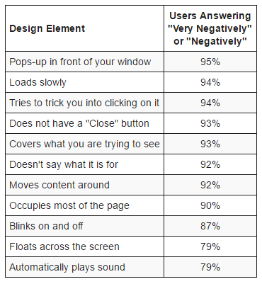
Image via Nielsen Norman Group
If you have one of those high-urgency websites that use immediate popups, callouts, or anything that blinks – please make sure you’re using these techniques responsibly and that you’re tracking your performance to make sure it’s working as intended.
They usually don’t, but there are some select cases when popups are useful.
Autoplaying Audio or Videos
Generally speaking, people don’t want a loud and startling reminder that they forgot to turn their speakers down after their office dance party at 4:50 p.m. yesterday.
In addition to the rude awakening, it usually interrupts the browsing experience for your users. As you probably know, even the tiniest blip in the purchasing funnel can deter someone from making a purchase.
Here are some tips for autoplaying audio or video, if you must:
- Choose clips that are five seconds or shorter
- If it’s longer than five seconds, give the user the option to pause or stop
- Keep in mind: autoplay is more acceptable when the user is expecting it based on the link they’re clicking
Pay Special Attention to “High Consideration” Areas
How many times have you been to a website and you’re just about to click the “Complete Purchase” button, only to get cold feet and abort the mission because you had a bad feeling? Or what about the times you added an item to your cart, but then ditched it because you got confused or frustrated when you tried to move forward?
Spoiler alert: The point where a customer is ready to hand over their email or bust out those sacred 16 digits is a pretty important stage in the ecommerce process. Pay special attention to this area.
Ecommerce copywriting is critical for catching your reader’s eye, piquing their interest, and gaining their trust. As for the super high-interest areas where your lobbying for information, keep an eye out for my colleague Herbert’s piece on high consideration zones next week.
Reputation and Social Proof to Back it Up
Of course, nothing establishes trust like a strong reputation and a legion of happy customers who can vouch for you. So if your company is in its infancy or toddlerhood, keep in mind that the ultimate goal is to expand your brand and find your place in the industry.
On your quest to become as omnipotent as Apple or Coke, social proof is a huge factor in gaining trust: 70% of Americans claim that they look for product reviews before they purchase.
Social proof can take several forms in addition to product reviews, like press mentions, expert and celebrity shout-outs, customer testimonials (bonus for including photos), and trust seals like accreditations and security badges.
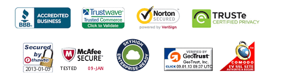
Image via HubSpot
A Case Study: The 4-Hour Workweek
Taking all the above considerations, let’s examine Tim Ferriss’ The 4-Hour Workweek website.
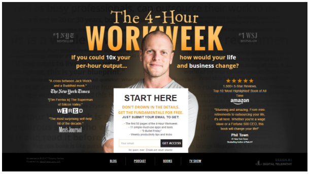
You’ll see:
- An orange/yellow color to show optimism, confidence, and warmth.
- A friendly, welcoming, and charming photo of himself to show his human side and personality while creating a connection.
- The logo is on the larger side, but it shares space with his photo to avoid being too loud or overpowering. This combo is more commanding than obnoxious.
- Social proof from heavy-hitting companies with great things to say about him.
- An informative, actionable, and clearly-defined call-to-action to collect user contact information. It even offers the first 50 pages of his book so users can “try before they buy” – a great way to build trust and confidence in your offering.
- A unique, but still familiar layout – if users don’t want to sign up just yet, they can still find a traditional navigation menu at the bottom of the screen.
All in all, you could say Tim Ferriss gets it.
Slow and Steady Wins the Race
All in all, it’s a valiant endeavor to build trust in the world of ecommerce. Keep in mind that it’s an ongoing effort. Trust can be fragile. It takes a long time to build, and just one or two bad experiences to break.
Hopefully, you have the resources to conduct usability tests and understand your users, or to perform A/B testing on your design and brand elements over time, so that you can have a bigger-picture grasp on what exactly you’re doing right and what you can improve upon.

